Bönland
Brand identity & packaging design
Group project w. Hannah Redkjær, Khalid Al-atti & Sara Gjesing
January 2024
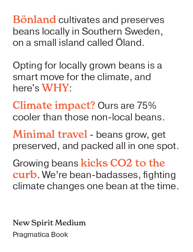
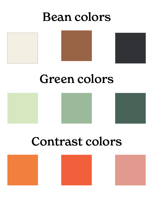
In this project, I've mainly been focused on graphic design, where my goal was to create a design that stays true to what we've worked out in our brand strategy.
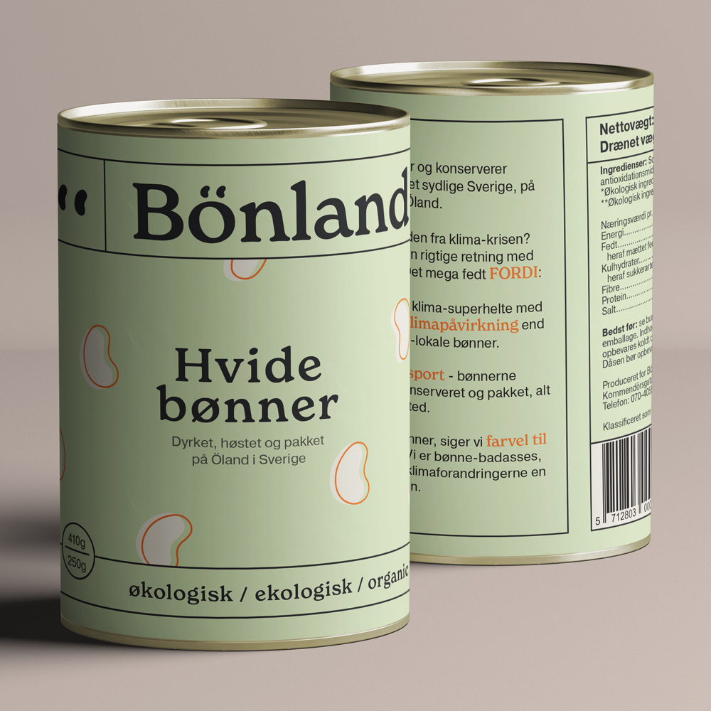
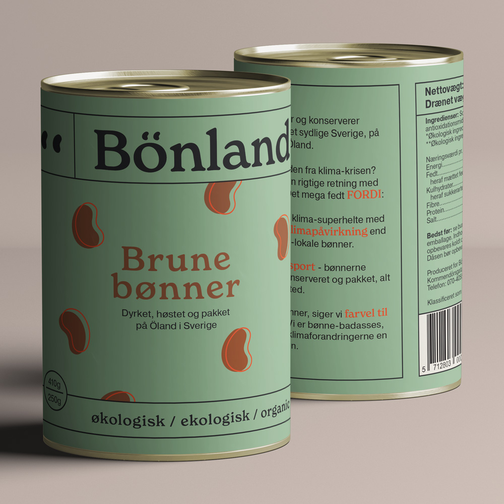
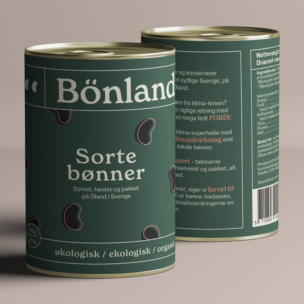
Description
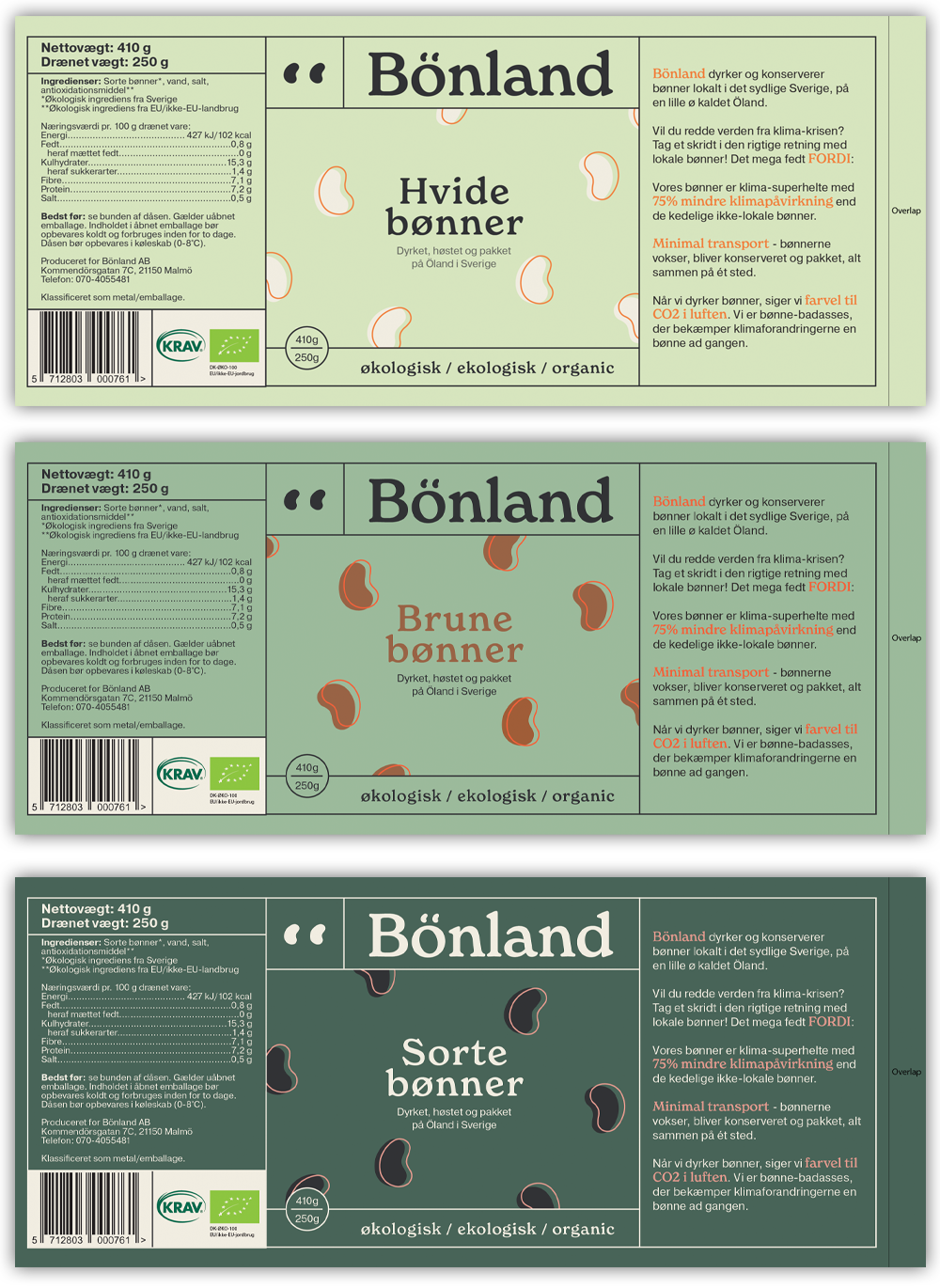
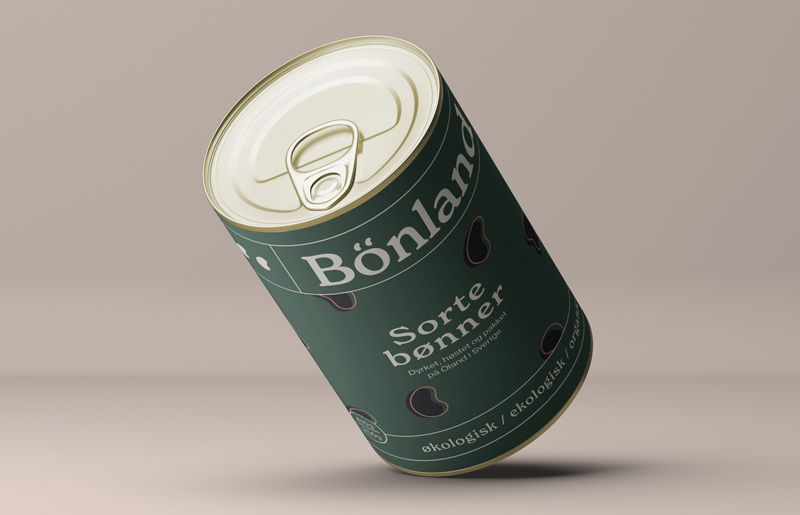
Bönland is a Swedish manufacturer of organic canned beans. They grow, harvest, cook and pack the beans on Öland, trying to be as climate friendly as possible. Our job was to create a brand startegy and visual identity based on research, and then apply it to their packaging.
Research
We did a lot of reasearch, using different methods, but one thing we found very interesting, was the fact that most Danes want to be more healthy and eat more plantbased, but 75% find it too difficult for various reasons. Another interesting finding, was that people who care about sustainability often find it hard to distinguish which products are actually better for the environment. We combined these two findings, and based our brand identity on "Taking responisbility for our planet should be easy".
Values
Responsibility • Informative • Authenticity
Tone of voice
Simple • Cool • Playful
The values and tone of voice are based on our target audience interviews and personas, that we worked with in our research phase, as well as interviews with Bönland.
Old logo → new logo
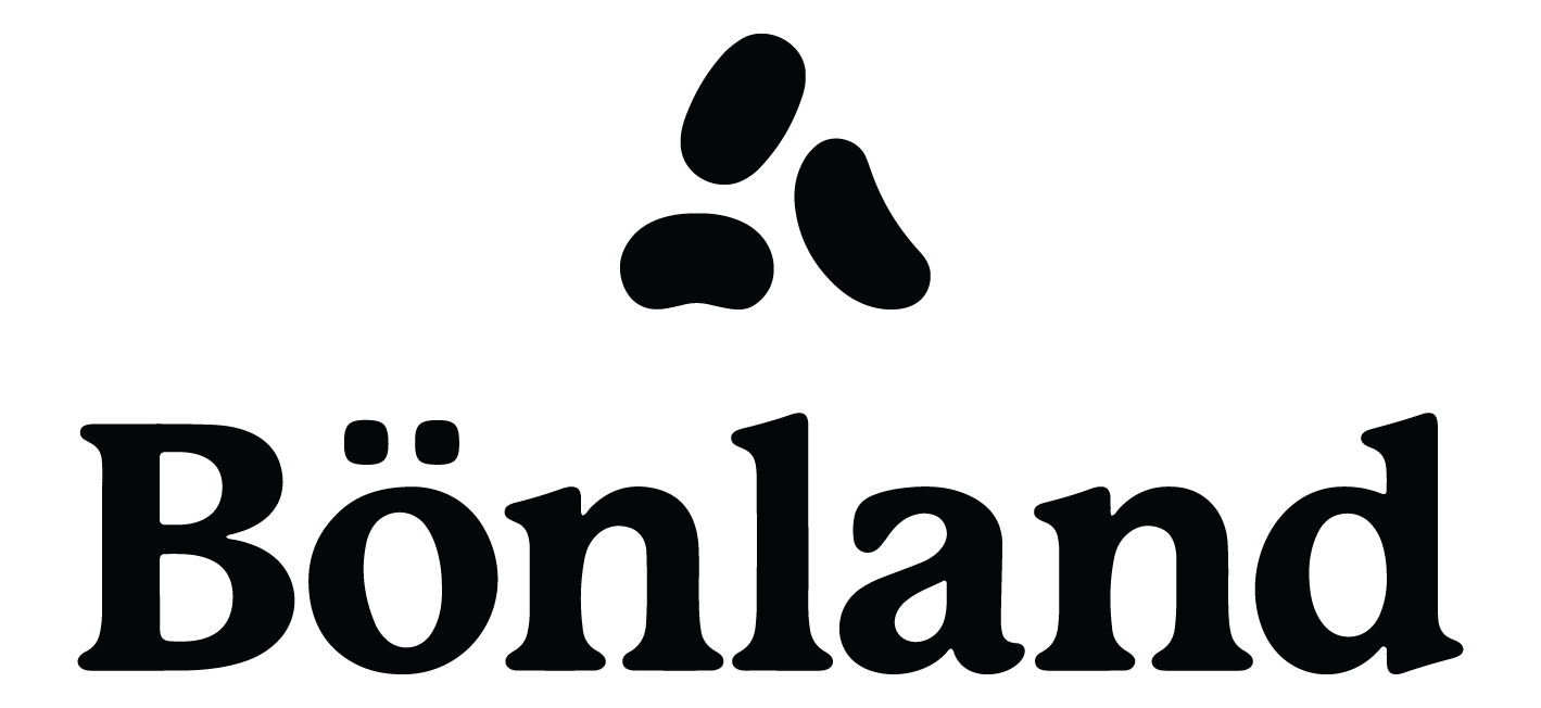
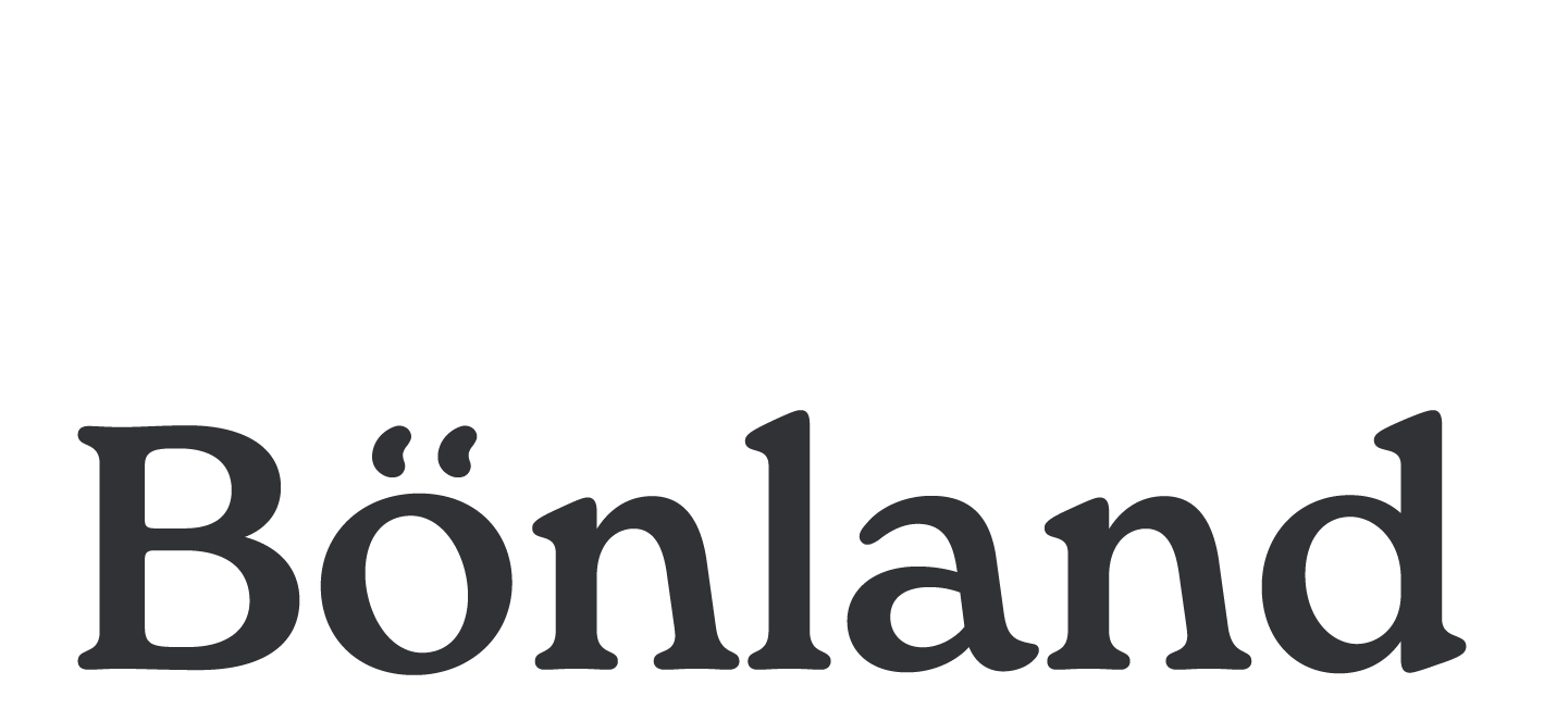
The new logo is designed to fit the tone of voice, as well as retaining some recognizability. The new font is a bit more modern and playful, and the beans have been incorporated as a part of the ö.
