GravidScan launched their first clinic without a clear brand strategy or identity. As they were expanding to a second location, they wanted to refine their brand to stand out and reflect their personality.
01. Research & Analysis
02 Brand strategy
03 Visual identity
04 Verbal identity
05 Implementation
Research & Analysis
Research
For this project, I have used various research methods. I conducted an online survey to kickstart my research and develop an interview guide, which I used for an Explorative Interview with three individuals from the target audience. These interviews provided valuable qualitative data and insights into the emotions and thoughts of the target group.
To analyze GravidScan itself, I performed a visual audit of the previous brand and conducted an interview with the company, where I asked in-depth questions about their brand.
I also applied Els Dragt's Trend Research from her book "How To Reaearch Trends", which provided a solid overview of societal trends relevant to my topic. Additionally, I conducted a Competition Audit of key competitors, gaining insights into similarities and differences between them and GravidScan.
Analysis
To gain a deeper understanding of what I found out in my research, I have used several analysis methods. I created an Empathy Map to understand the target audience’s behavior regarding their decision to opt for private scans, providing deeper insights into their mindset. Based on the interview with GravidScan, I developed a Golden Circle and a Brand Personality Spectrum, both of which helped shape the brand strategy.
I continued using Trend Analysis methods from the Els Dragt book, which helped consolidate the findings from my initial Trend Research. To gain an overview of competitors and identify potential market gaps, I worked with positioning maps.
Insights
I summarized everything by creating Smart Insights for each area: Consumer, Client, Culture, and Category.
Consumer
My pregnancy is my greatest, yet most fragile joy
Client
You and your baby deserve the highest level of professionalism
Category
We offer the reassurance you won’t get in the public sector
Culture
The healthcare system isn’t good enough for my child
Brand strategy
Brand message
GravidScan is an ultrasound clinic with a high level of expertise, supported by our many years of experience, professional training, and certified equipment.
Every expectant mother should feel safe and comfortable with us, whether the news is joyful or challenging. This sense of reassurance stems not only from our expertise but also from the warm and compassionate care we provide at our clinic.
WHY are we here?
We provide expectant mothers with the care and expertise they need to feel secure throughout their pregnancy
What do we do, and how?
We offer reassurance to expectant mothers through fertility and pregnancy scans, combining professional expertise with genuine care for each individual
How do we stand out?
By blending our extensive expertise and years of experience with a deeply personal and compassionate approach
Who are we here for?
We are here for pregnant women, and those hoping to conceive, who seek greater peace of mind
What de we value the most?
Professionalism - We are trained and certified because we believe that's what you deserve
Reassurance - Our expertise is your peace of mind; you can trust that you are in skilled and experienced hands
Compassion - We welcome all emotions and always take the time to ensure you feel seen and heard
What's our personality?
Trustworthy - We must appear trustworthy to build confidence in us and our expertise
Calm - We create a sense of calm and reassurance for expectant mothers, ensuring they have a comfortable experience with us
Inclusive - We make space for all emotions, whether heavy and sorrowful or joyful and full of laughter
What's our ambition?
To become the preferred scanning clinic in Zealand. We strive to be the clinic(s) that mothers recommend to one another and that everyone speaks highly of.
Visual identity
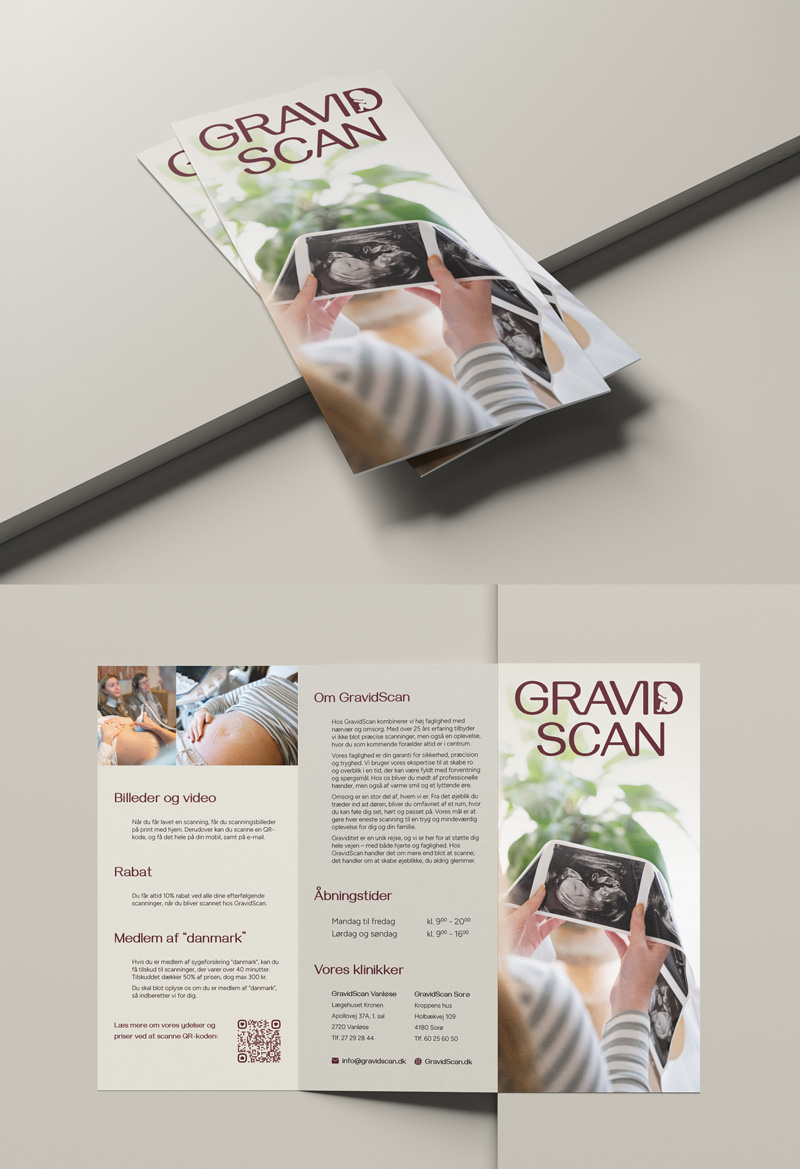
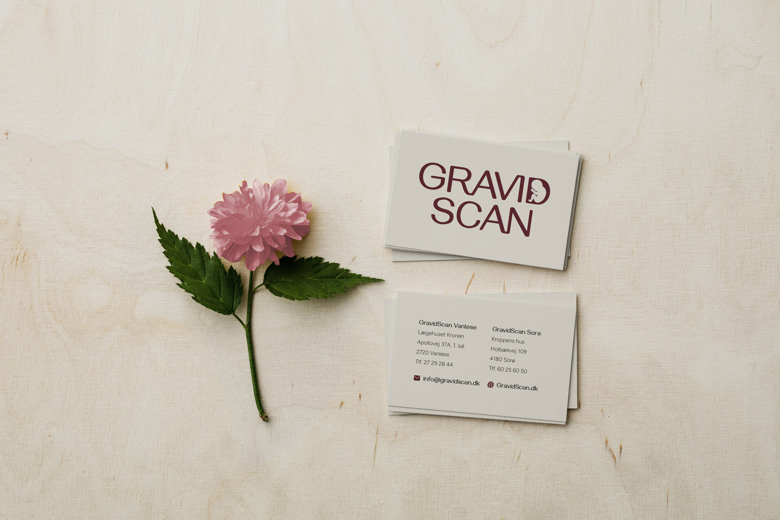
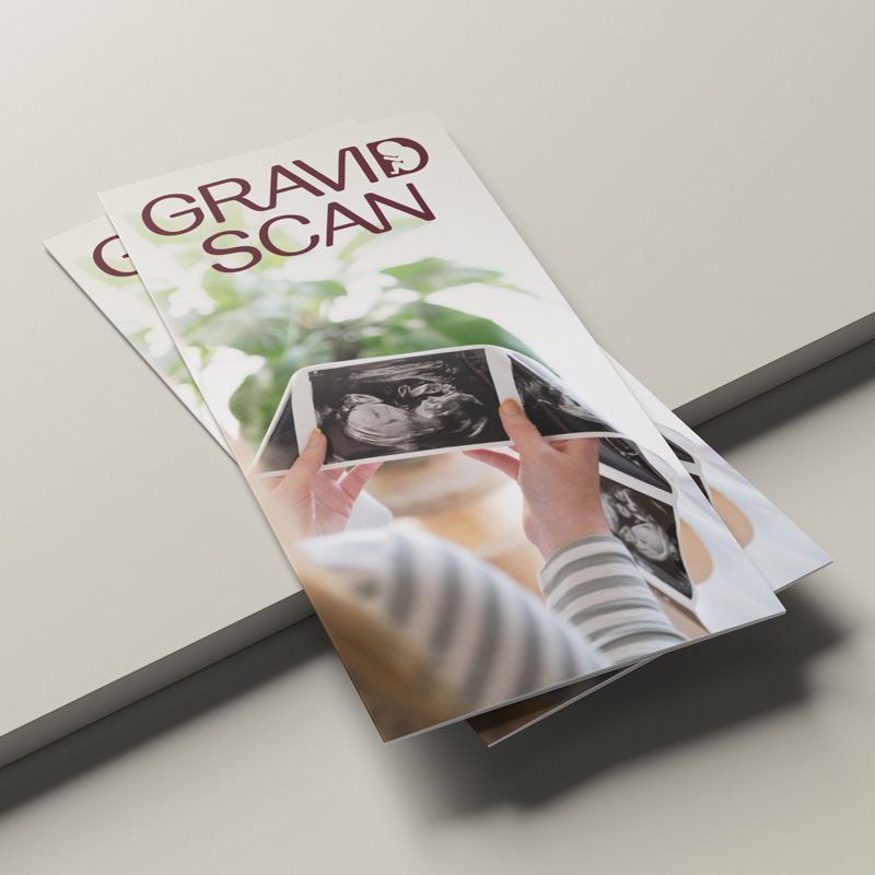
Logo
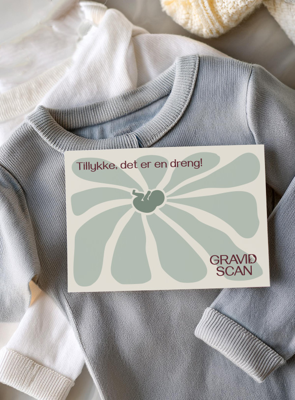
The logo is based on a typeface with slightly rounded edges to soften the overall look. It is centered with an intentional alignment of the right sides of the two "A"s, forming an invisible line that adds balance and elegance. Some of the letters are connected to create a closer and more intimate feel.
Inside the "D," there is a small baby filling the entire letter to convey a comforting, enclosing feeling, turning the "D" into a symbol of pregnancy. This is a subtle detail that might go unnoticed in smaller formats or at a distance but reveals a meaningful story about the brand when noticed.
The logo captures GravidScan's caring and nurturing side through its rounded edges and the baby detail, while the professional and expert qualities are reflected in the simple font and the light, elegant design achieved through font weight and balanced alignment.

Color palette
The color palette consists of an almost-black and a light beige, used instead of pure black and white to create a softer look with less harsh contrast.
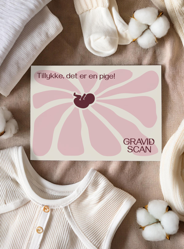
The green tones symbolizes hope, growth, and health, which resonates positively with an expectant mother. In contrast to the greens, there is a deep red and a soft pink shade. Red is complementary to green, and combining these tones creates a harmonious palette. Like the greens, the reds are muted to maintain a calm and balanced feel. The reddish tones symbolize warmth and love while also conveying a feminine energy.
The overall palette is neutral in temperature, to preserve a professional and refined impression. Together, the colors embody both professionalism and warmth, mirroring the essence of the logo. Professionalism is reflected in the muted tones and cool neutrality, while the warmth shines through in the reddish hues and soft accents.
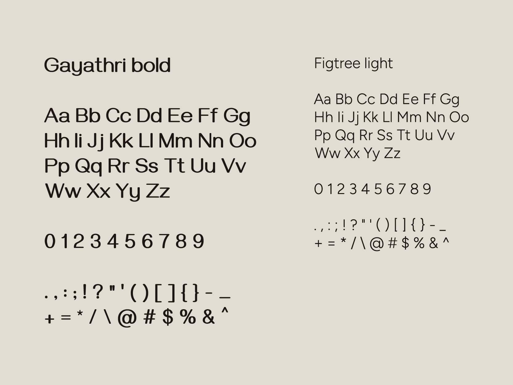
Typography
Gayathri Bold is used for headings and is also the font used to create the logo. It features rounded edges, reflecting soft values. Additionally, it has a slight contrast in its stroke, which, combined with its moderate weight, gives it an elegant and modern appearance.”
Figtree Light is used for body text. While this font does not have rounded edges, when used in light weight for body text, the sharp edges are not noticeable. Instead, the sharper edges enhance readability and clarity. Figtree is described by its designer as "walking the line between simplicity and friendliness".
These two typefaces complement each other well, as their letterforms are similar. According to the Gestalt principle of similarity, objects that resemble each other are perceived as part of a cohesive group.
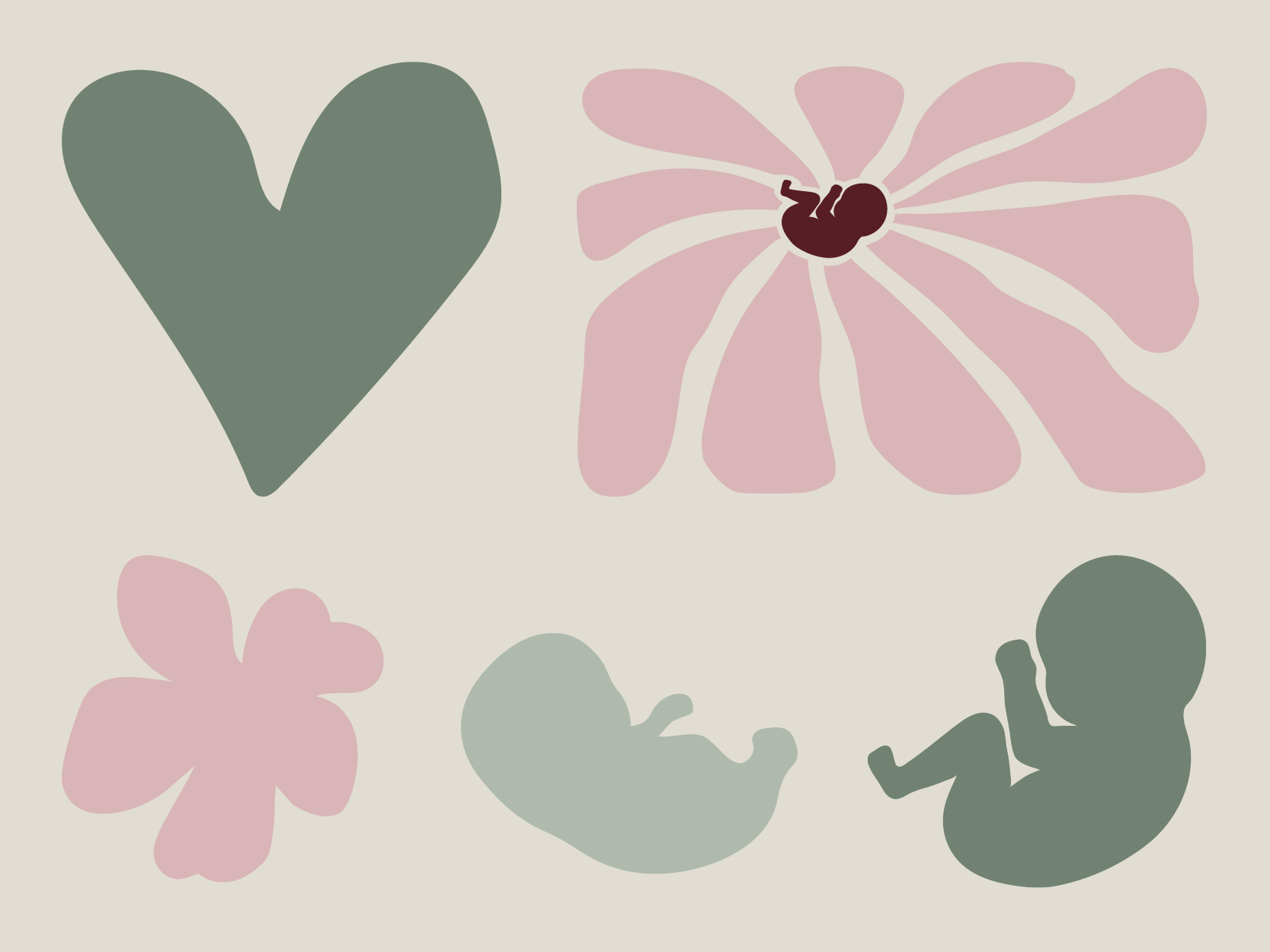
Illustrations
The illustration style is minimalist, featuring soft lines that can be either smooth or slightly uneven. The illustrations primarily reflect gentle and caring values, adding warmth and life to the overall expression.
They can be used to create better balance in areas where professionalism takes center stage. Despite their warmth, the illustrations maintain a calm appearance due to their simple and minimalist design, using only one or a few colors per illustration.
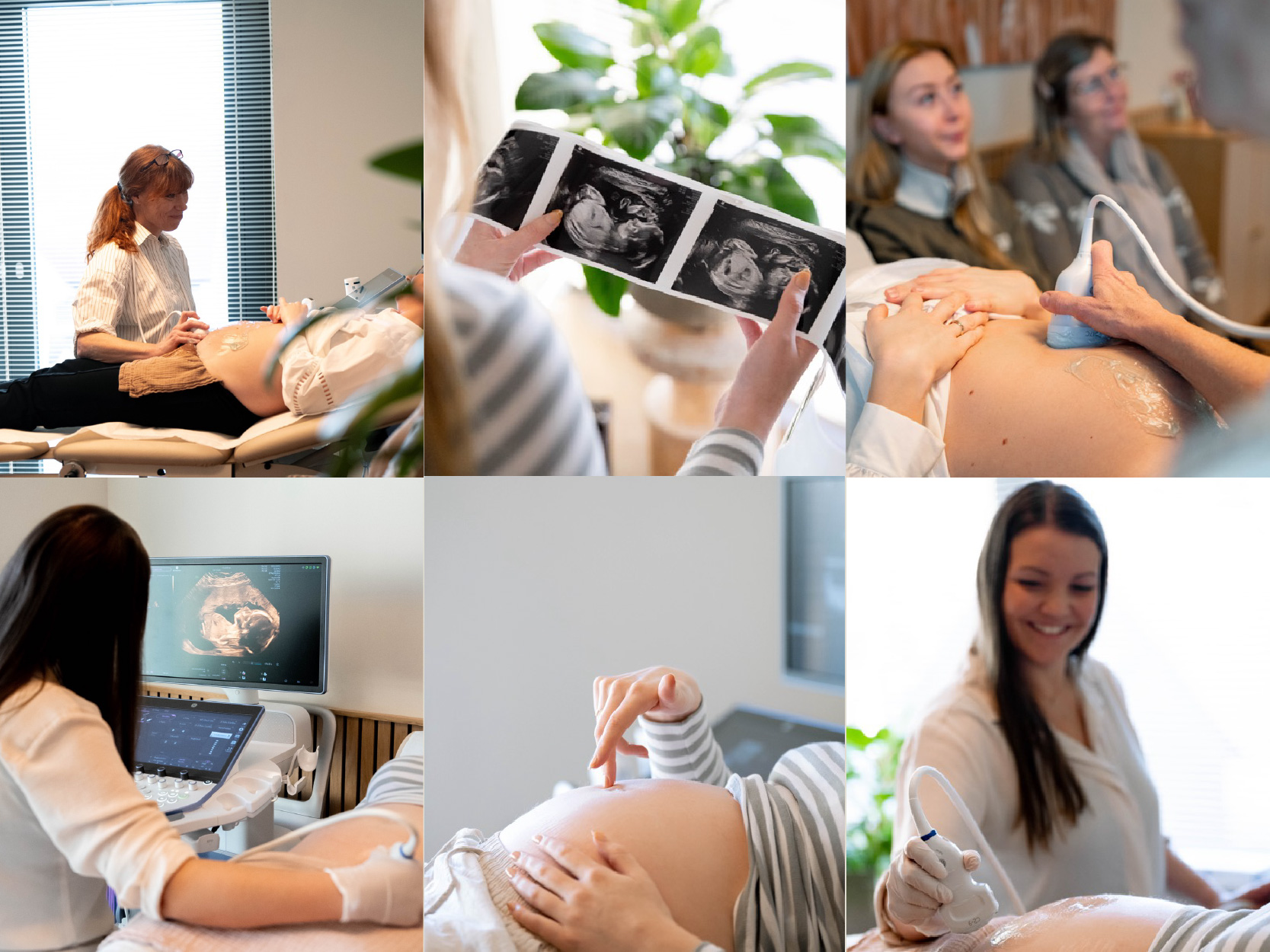
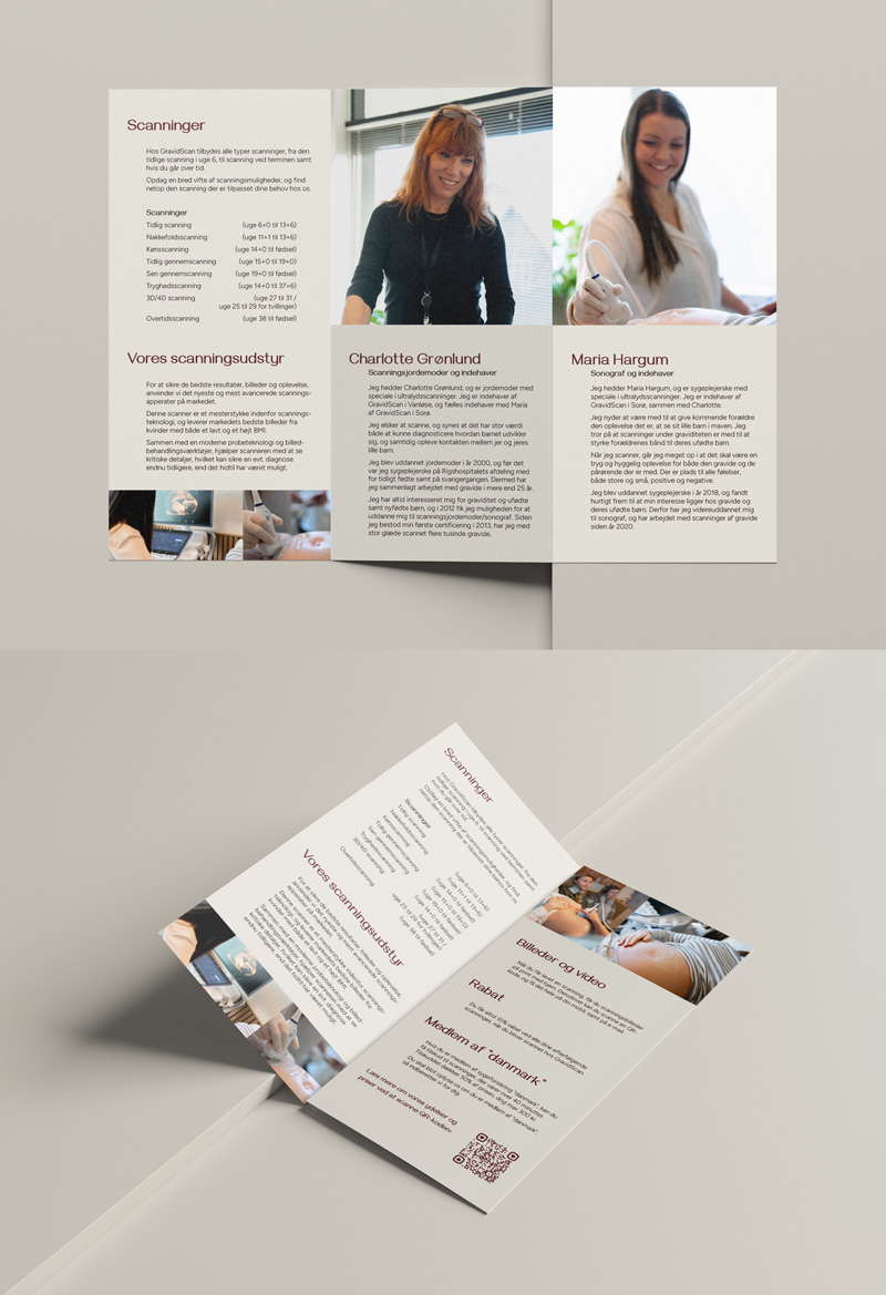
Images
The photo style allows for a stronger emphasis on professionalism compared to the illustrations. This can be reflected in images of ultrasound equipment, scanning sessions, and similar contexts.
However, there is still room for a sense of comfort and care, which can be conveyed through images with soft, warm lighting and subjects that celebrate the beauty of the female body and the baby growing within, as well as the warm and comforting experience at the appointment.
All images should maintain a consistent style in terms of color and tone. They should avoid feeling too cold or sterile, instead embracing a naturally warm glow. Neutral and natural colors, as well as the green and red tones from the color palette, provide a solid foundation for a cohesive visual style.
Photos by De Små Øjeblikke
Verbal identity
Professionalism
Reassurance
Compassion
At GravidScan, we combine expertise with care and compassion. With over 25 years of experience, we offer not only precise scans but also an experience where you, as an expectant parent, are always at the center.
Our professionalism is your assurance of safety, accuracy, and peace of mind. We use our expertise to provide clarity and reassurance during a time that can be filled with anticipation and questions. Here, you will be met with skilled hands, warm smiles, and a listening ear.
Care is at the heart of who we are. From the moment you step through our doors, you’ll be embraced by an environment where you feel seen, heard, and cared for. Our goal is to make every scan a safe and memorable experience for you and your family.
Pregnancy is a unique journey, and we are here to support you every step of the way—with both heart and expertise. At GravidScan, it’s about more than just scanning; it’s about creating moments you’ll never forget.
Implementation